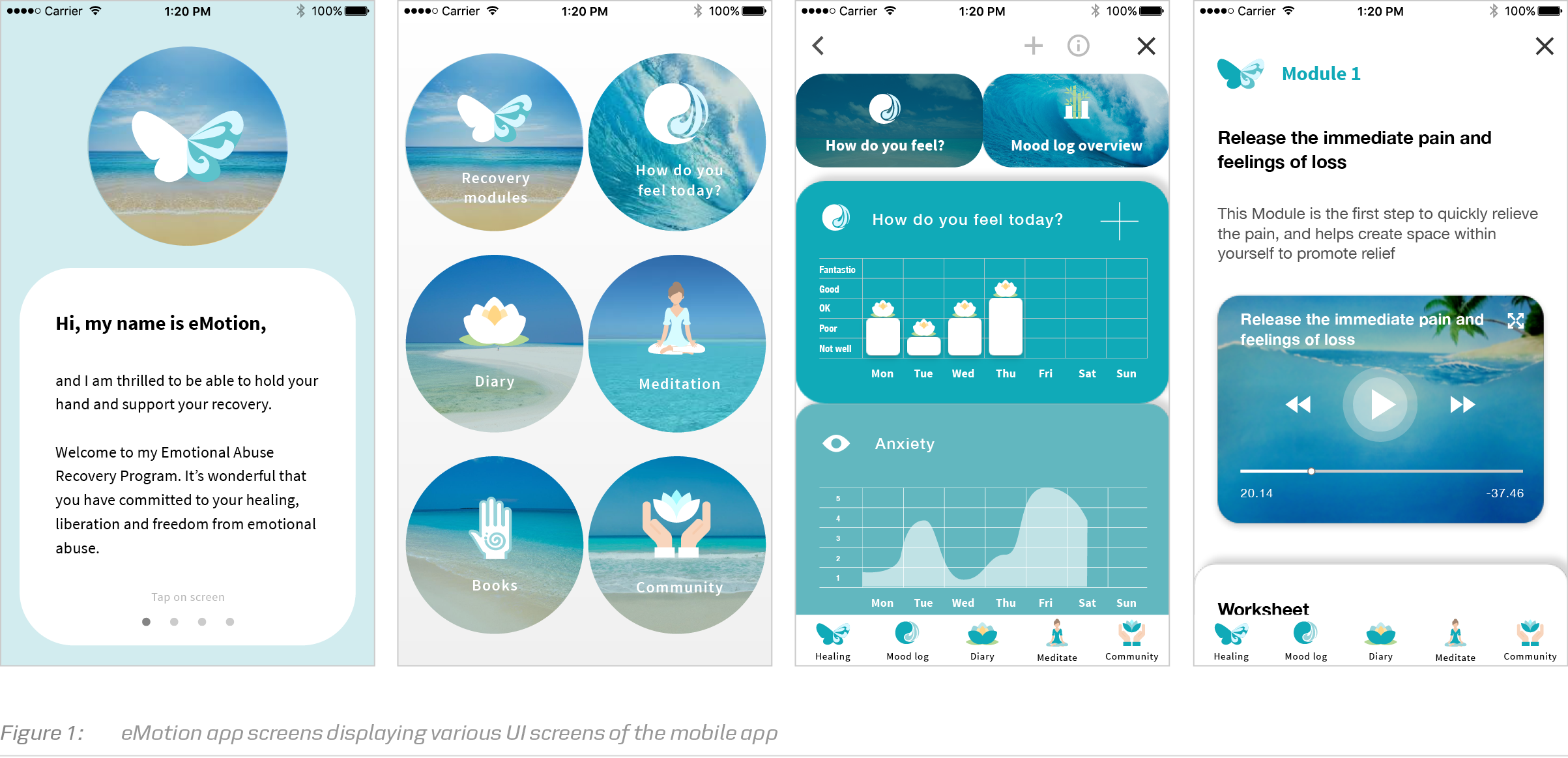
eMotion app
- Project:
- Year:
- Bachelor project
- June 2018
Adobe XD | Mental Health App | Illustrator | Photoshop | Vector Graphics
The aim was to create a recovery app for women, who suffered from an emotional abuse. The app should support the victims of the abuse in their recovery journey, have a step-bystep professional recovery program and an internal community forum.
Problem
Many women who have been in psychological and emotional abusive romantic relationships do not get professional help due to various factors such as a sense of embarrassment dealing with the topic or high therapy costs. Self-help material has been long available for people who experienced domestic violence but there is no one single self-help solution that incorporates all the best recovery practices.
Project aim
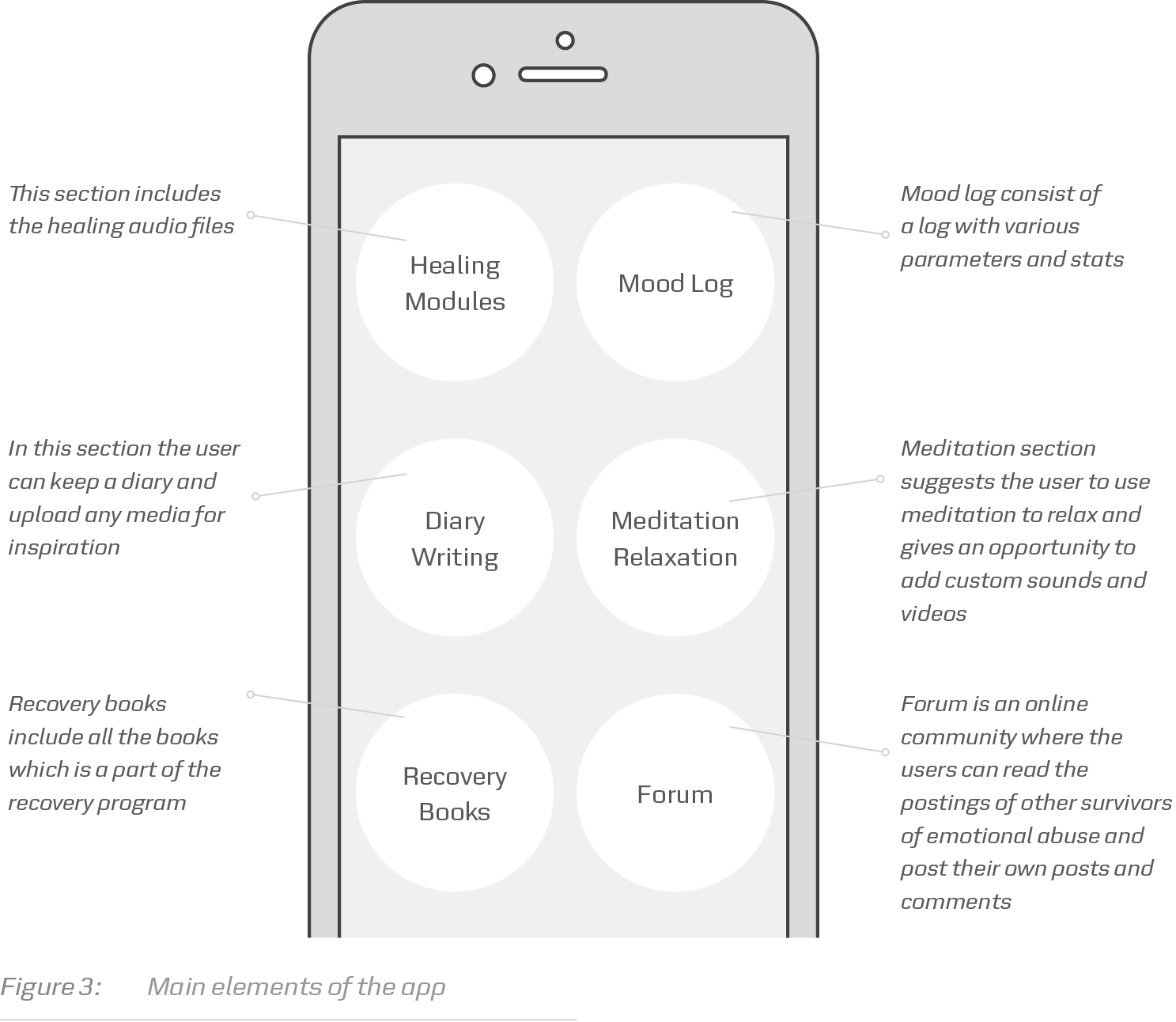
My intention was to create a recovery app for women who have suffered an emotional abuse in romantic relationships. The app would support the victims in their recovery journey, have a step-by-step professional recovery program directed to healing from emotional abuse, recovery journal, mood log and an internal community forum, that would allow the victims of abuse connect with each other.

Concept development
I started this project by exploring the literature related to the recovery and healing programmes from emotional abuse and selfhelp methods of recovery. Karakurt and Silver (2013) state that “the effects of emotional abuse are just as detrimental as the effects of physical abuse”. I studied people who will be the core users of the app to understand their needs and behavior.
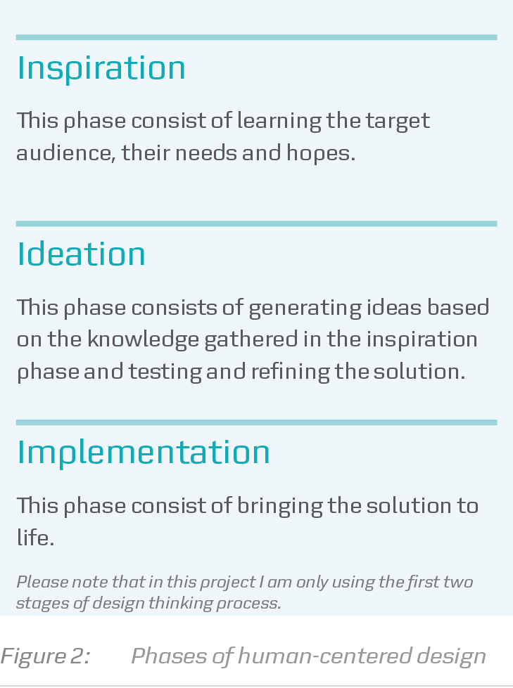
I used a human-centered design approach at each stage of the design process. “Human-centered design offers problem solvers of any stripe a chance to design with communities, to deeply understand the people they’re looking to serve, to dream up scores of ideas, and to create innovative new solutions rooted in people’s actual needs” (IDEO, 2015, p. 9).
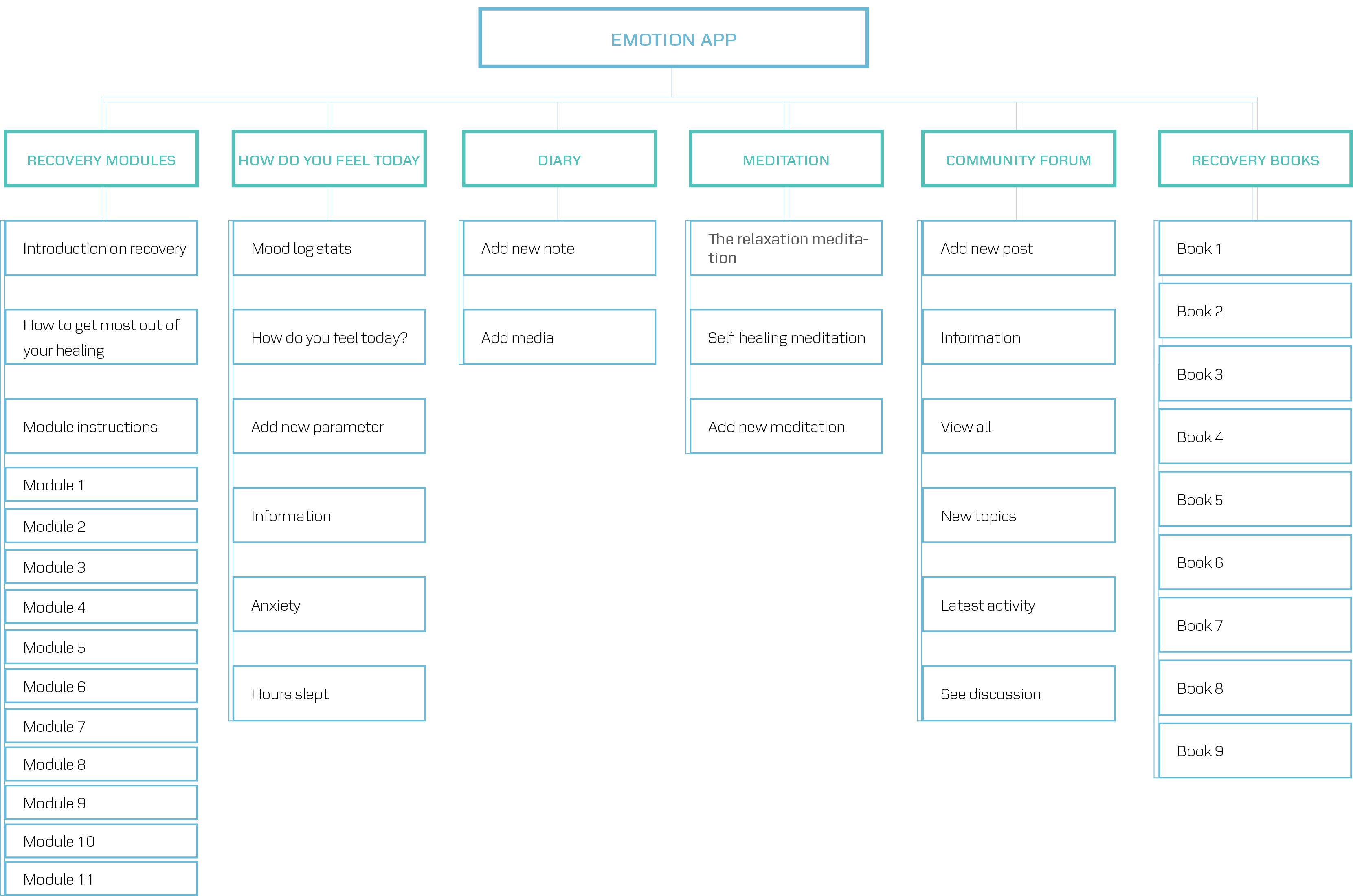
Navigation structure
The navigation structure in the app is tabbased and is a mixture of two IA patterns that include hierarchy and nested menu (Wroblewski, 2011). Hierarchy is used in the following sections: recovery modules, meditation and books, while a mixture of nested menu and tabbed view is used in mood log and community sections, where the user can’t navigate between spokes but must return to the tabbed view first. See Figure 10 for navigation patterns. Various shades of the blue color were carefully selected to represent calmness, friendliness and give the survivors of abuse a sense of security. Blue is known to represent piece and spiritual meaning in many countries.
Interactive prototyping
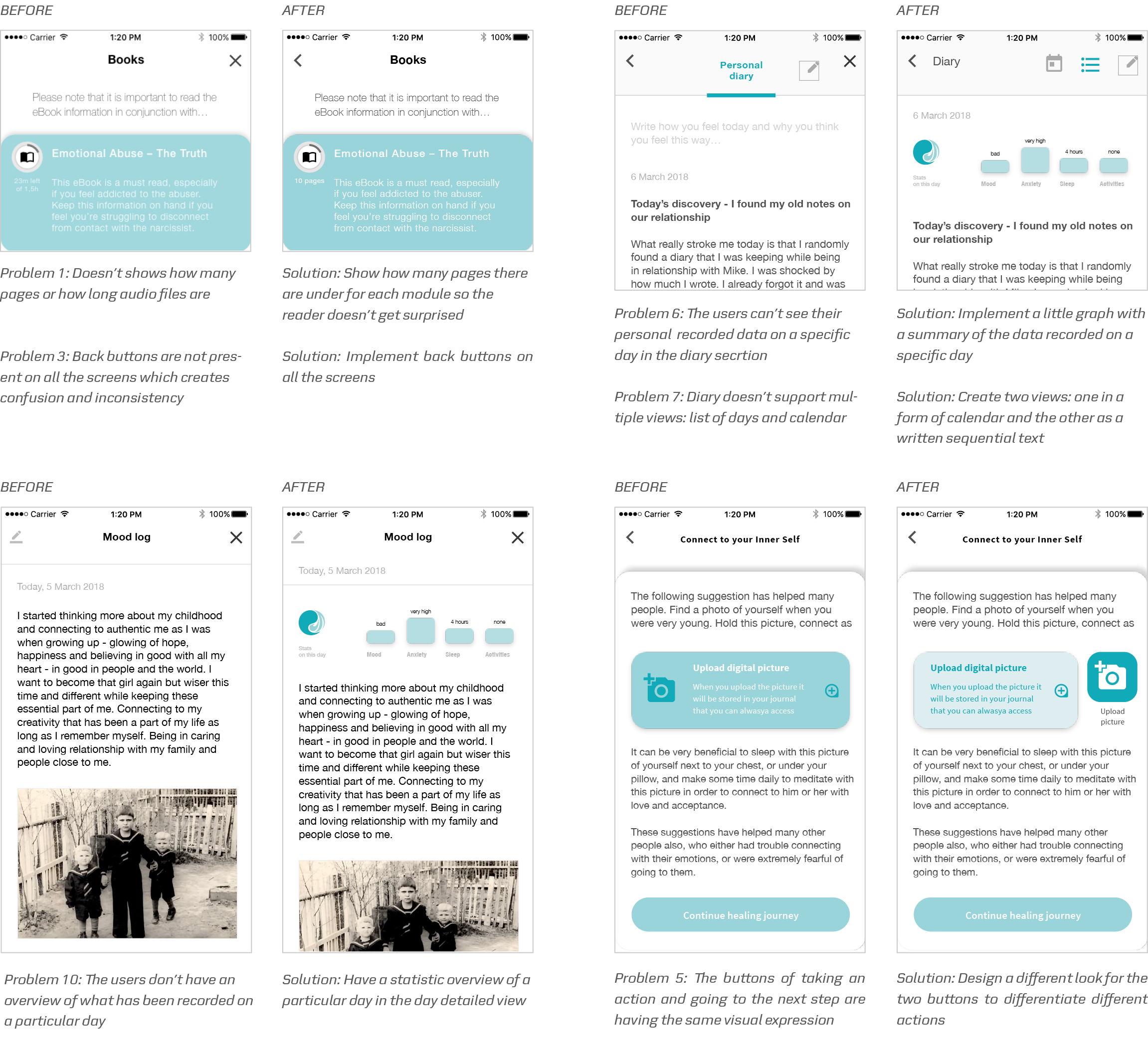
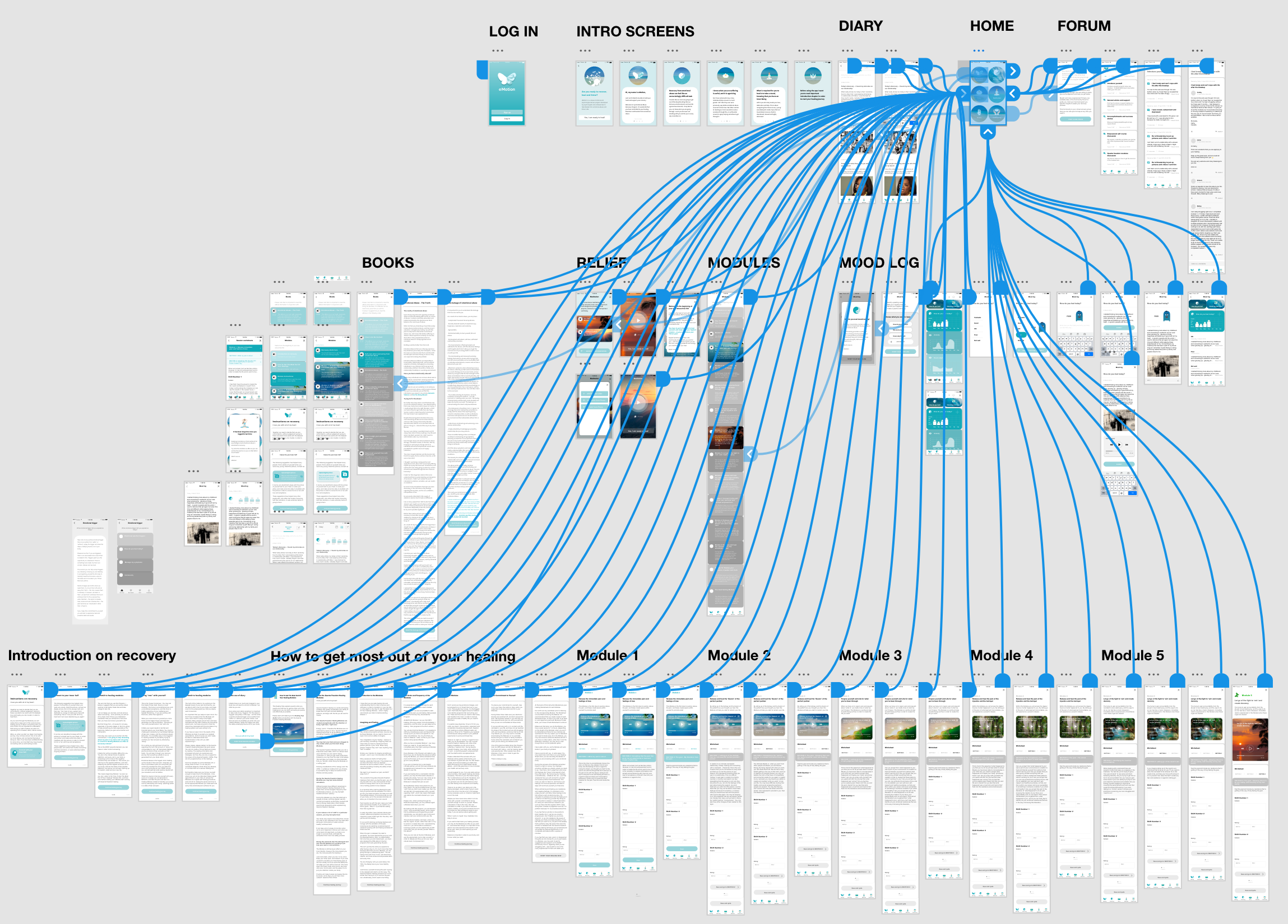
In the next step I designed and developed a functional prototype using Adobe XD, Illustrator and Photoshop software. The aim of an interactive prototype was to let the users interact with the app in order to gather valuable feedback and discover potential problems or suggestions to improve the product.
I used an agile development method taking Design Thinking approach as mentioned above, so I could iterate the prototype based on the feedback I collected from the users of the technology. Design thinking ensures that the application creates an intended user experience by fostering an iterative user-cantered approach during the entire design lifecycle (IDEO, 2015). Well-structured information architecture is essential for the users to adjust to the functionality of the app and use the application without effort (Spencer, 2010). Therefore, when designing mobile application, I had to keep focus on both the user interface and the information architecture.
Testing the concept
Usability testing with end users
Usability tests were conducted to evaluate the app and identify potential problems and usability issues. Testing participants were women, who at some point of their lives were in emotionally abusive relationships for a period of at least 3 years. I conducted usability tests with the survivors of emotional abuse to see if the app has a potential to become a product. Results showed that the users liked the idea of having a personal app on their phones, which both includes recovery modules but also has a section dedicated to self-work and self-reflection. Furthermore, users loved the self-development features of the app such as the diary, mood log, forum and meditation components of the app. They also emphasized the importance of connecting to other survivors of abuse and read their stories to reduce the feeling of isolation.
Usability testing with mental health professionals
Interviews with mental health professionals provided insights into what parts of the app can be improved and revealed their thoughts on the potential of a self-help app as a recovery tool. Mental health experts provided an array of suggestions to improve the app and adviced on the best recovery selfhelp practices. The results collected from both usability testing and interviews with medical experts suggest that a recovery after emotional abuse app is promising and has a potential to be a part of the recovery process for survivors of emotional and psychological abuse.
