Banner Project
- Project:
- Year:
- Banner Project
- 1st semester 2013
HTML, CSS | Edge Animate, Illustrator | FileZilla | Vector Graphics, Bitmap Graphics, Animation
The purpose of this project was to work with animation and different types of graphics in order to create a banner and a landing page.
Promotion of an artist
EdgeAnimate is a miracle.
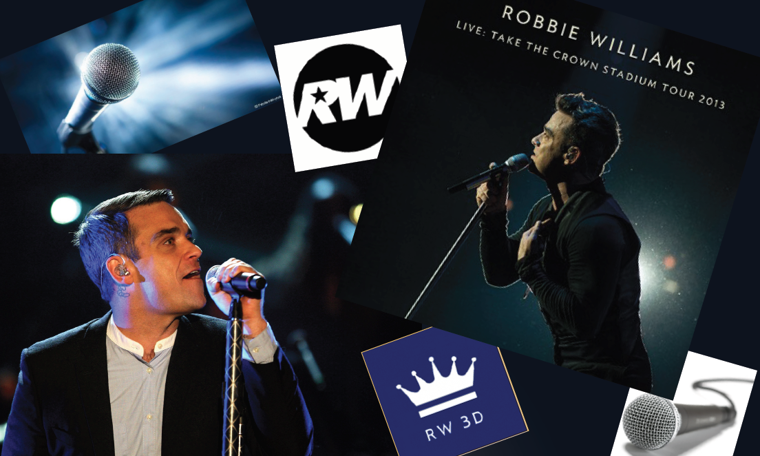
Universal Music Group wants to promote Robbie Williams live show with the name “Take the crown” in Copenhagen.
The aim of the live show is to promote the new album directed to a target audience of 16- to 29-year-olds.
Creating good functioning banners with better design can attract more viewers resulting in more visitors on the landing page and later buying the tickets for the live show.

Gif image of landing page | HTML | CSS | Adobe Edge Animate
inspiration


Color choice

Color is an important element in advertising banner development. A poor choice of color may ruin the whole viewers experience.
Color plays a pivotal role in our visual experiences.Colorcom
The color choice for this banner project was made by extracting colors from one of the images of Robbie Williams concert.
The colors create an atmosphere of show, live music and merriment.
The text color contrasts with the background color to draw attention of the viewer.
Font choice
For the text I used Lucida Sans Unicode since it as a clear and thin font, which creates the feeling of exclusivity and easy to read even on a narrow banner.
Presentation

Knowledge
During the project I have learned how to design the banners using vector and bitmap graphics rather by working with Adobe Illustrator and Photoshop software. In the project 90% of the graphic design was made in Adobe Illustrator software.
Well-functioning multimedia producat is a matter of knowledge and experience.
Since I have worked with Illustrator before and feel confident working with the program, I concentrated my attention on learning the animating techniques working in Adobe Edge Animate, which is a new animation software, that creates the animation and graphics based on HTML, CSS and JavaScript.
The next step was the creation of a landing page. I was challenged by this task since both the mark-up language for creating web pages - HTML5 and the style sheet language for designing the look of the web page – CSS are both completely new to me.
I had to spent long time gaining the needed knowledge in order to make the landing page perform aesthetic design, since it looks easier to use, functionality, in order to make a user-friendly web page and aesthetic consistency, in exchange for creating the overall consistency of style and appearance between the banners and the landing page.
Finally publishing the banners to a webpage took longer time than I have expected due to missing knowledge of embedding the banners to an excising webpage.
The knowledge about idea generation, concept development, planning and management of multimedia tasks helped me to manage the working process and to deliver the project on time.